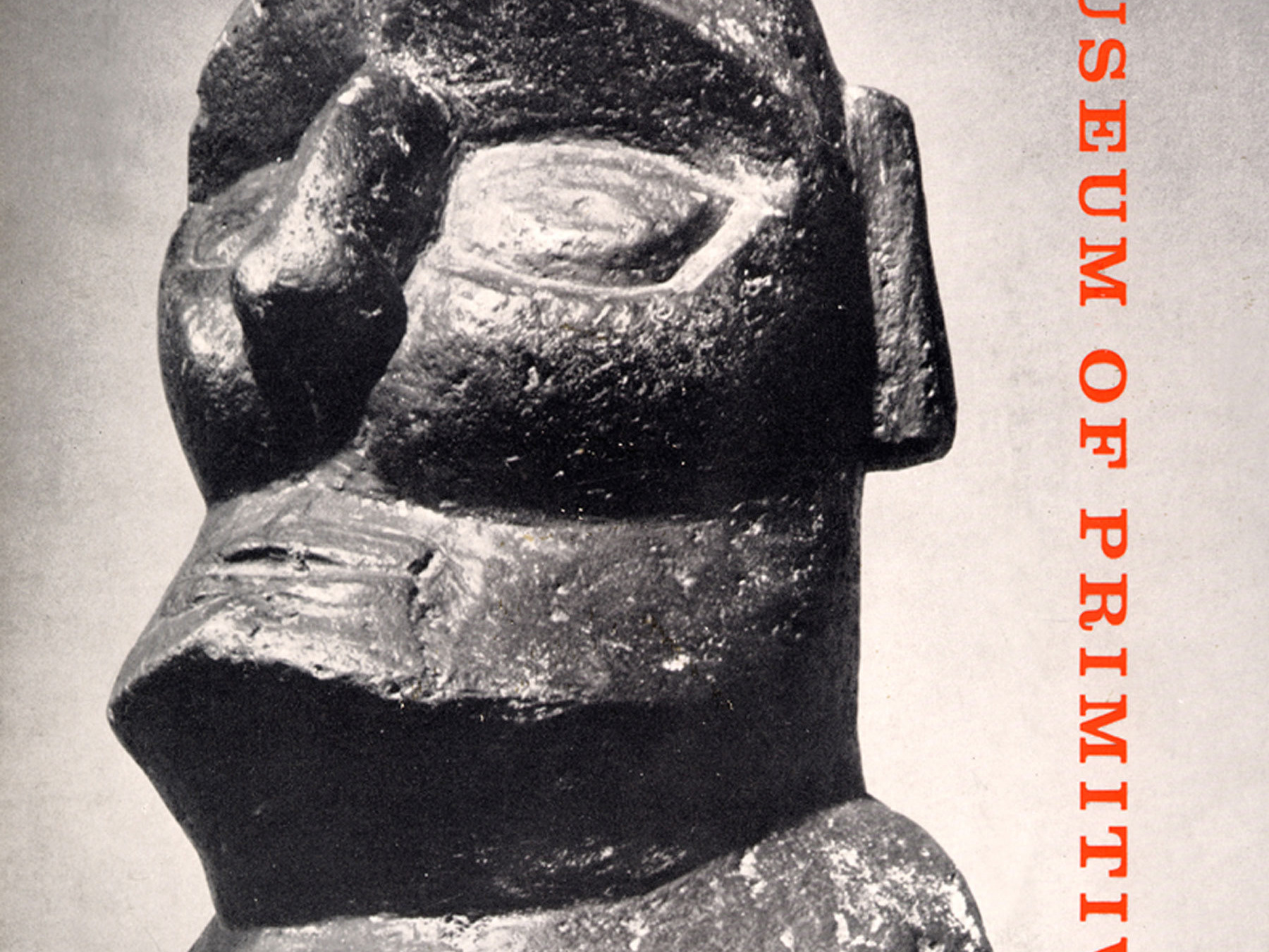
Eisenbahn typeface
Design Brief
Create a new typeface based on DIN Condensed. The design should be based on an understanding of the classic's historic context/intent, distinguishing features, personality and general structure. Contrast and harmony should be design considerations.
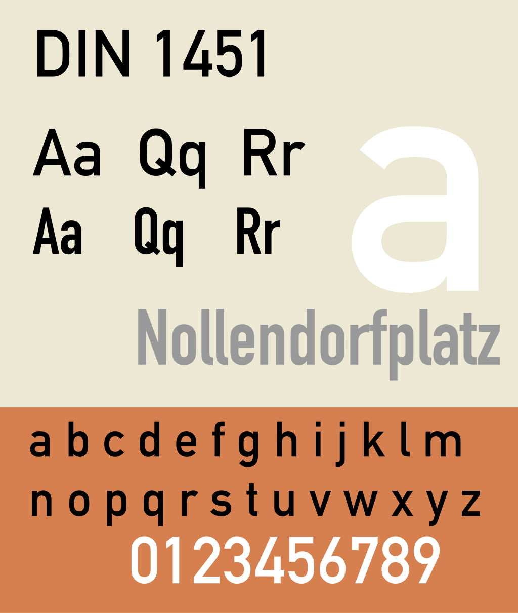
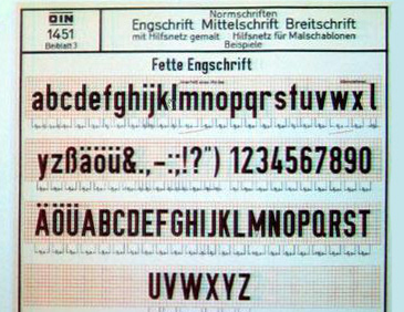
DIN 1451
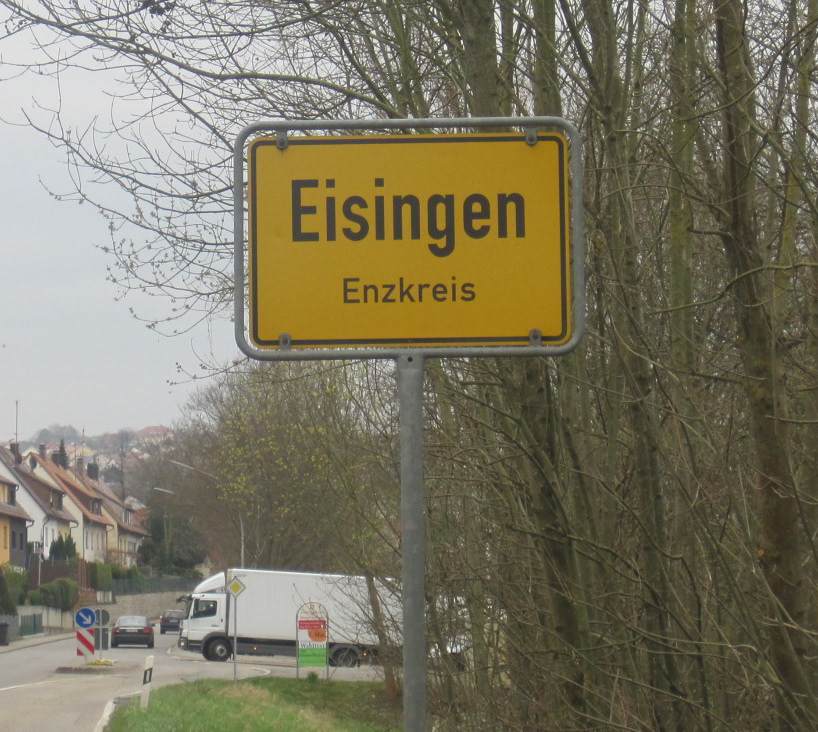
Originally created in the early 1930s. It was commissioned by the Deutsches Institut für Normung (German Institute for Standardization), which sought to establish a standardized and highly legible typeface for road and transportation signage in Germany. With the rise of the automobile and the need for consistent and easily recognizable signs on the newly expanding road network, DIN 1451 was meticulously designed to optimize readability and clarity. Its distinctive, sans-serif letterforms, uni- form stroke widths, and simple, geometric shapes allowed for quick comprehension, even at a distance, making it an ideal choice for the clear and unambiguous communication of information on road signs and beyond. DIN 1451's enduring popularity and adaptability have also made it a staple in various design applications, reflecting the success of its initial purpose.
Motivations, Inspiration, and Keywords.
My main motivation when creating this typeface was to add sturdy slab serifs to the already existing DIN Condensed typeface. I felt this would add enough contrast while also maintaining a nice pairing to DIN Condensed. While still keeping the typeface easy to read and direct, I wanted to keep the clean geometric qualities of this typeface intact.
strong enough to withstand rough work or treatment.
without intervening factors or intermediaries.
characterized with regular lines and shapes.
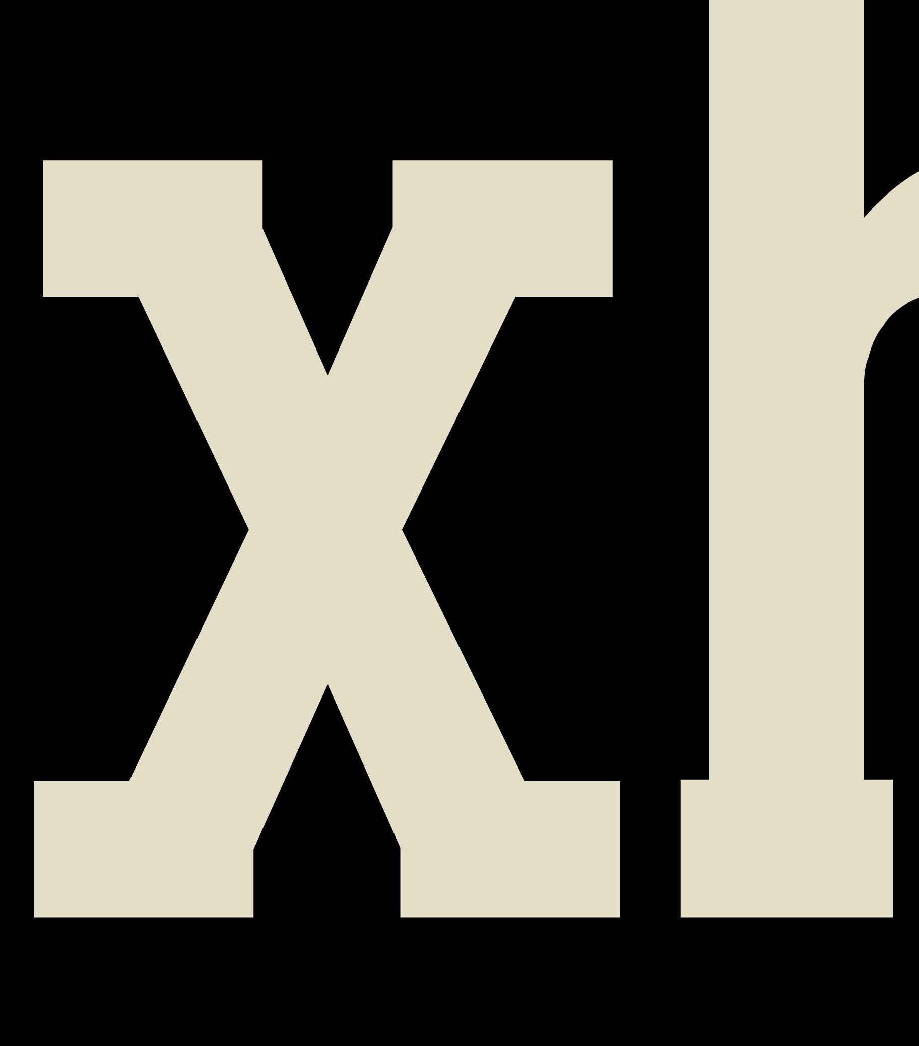
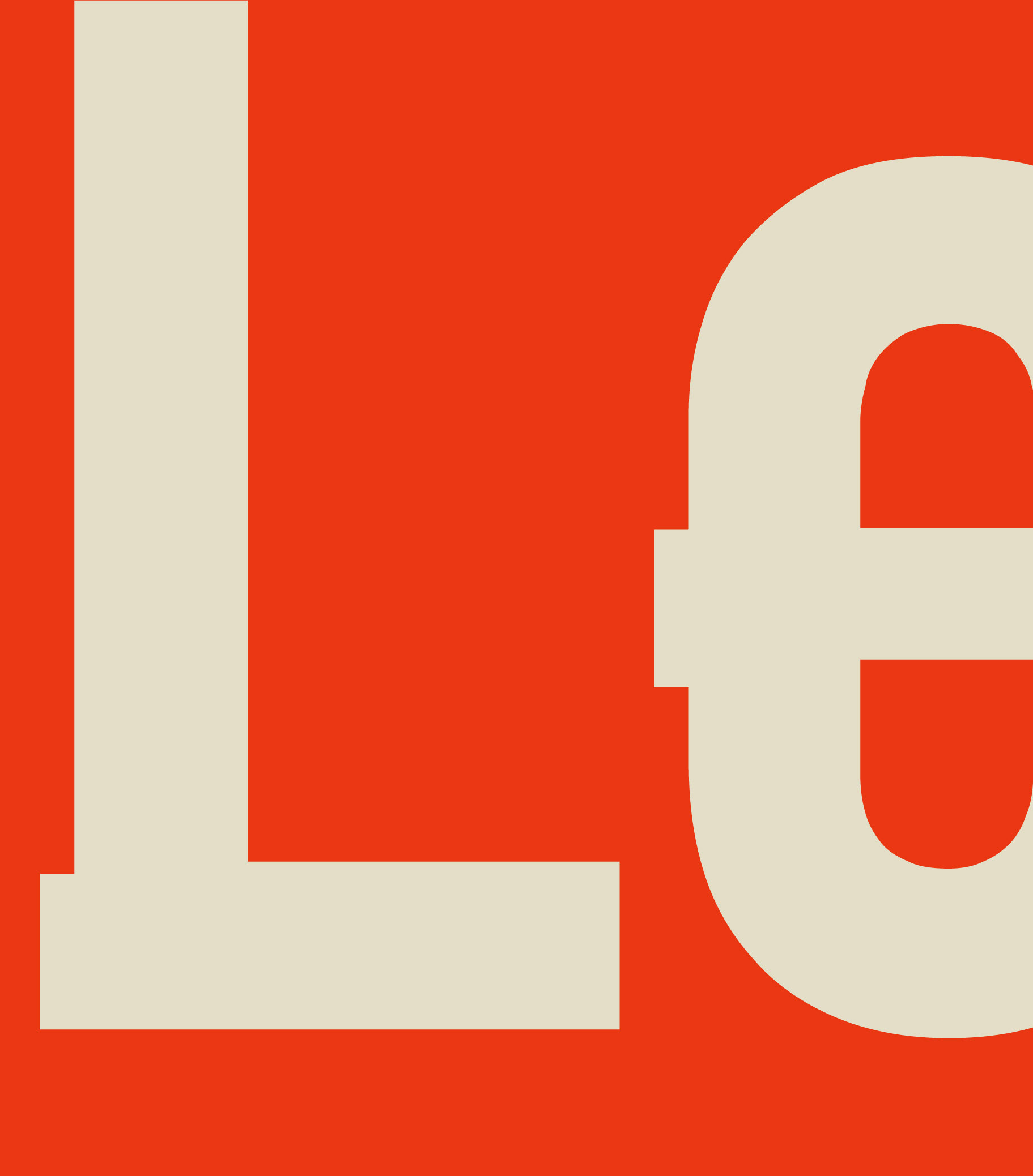

geometric (left), sturdy (middle), direct (right)
comparison of typefaces overlayed (pink is Eisenbahn and purple is DIN Condensed)
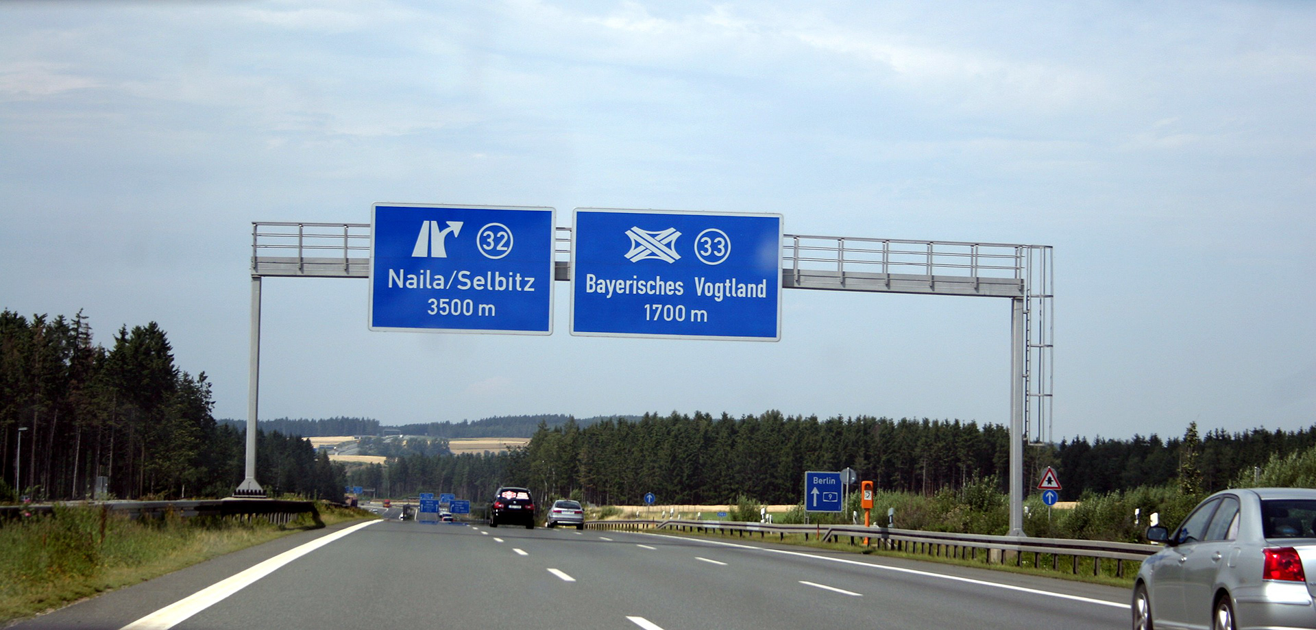
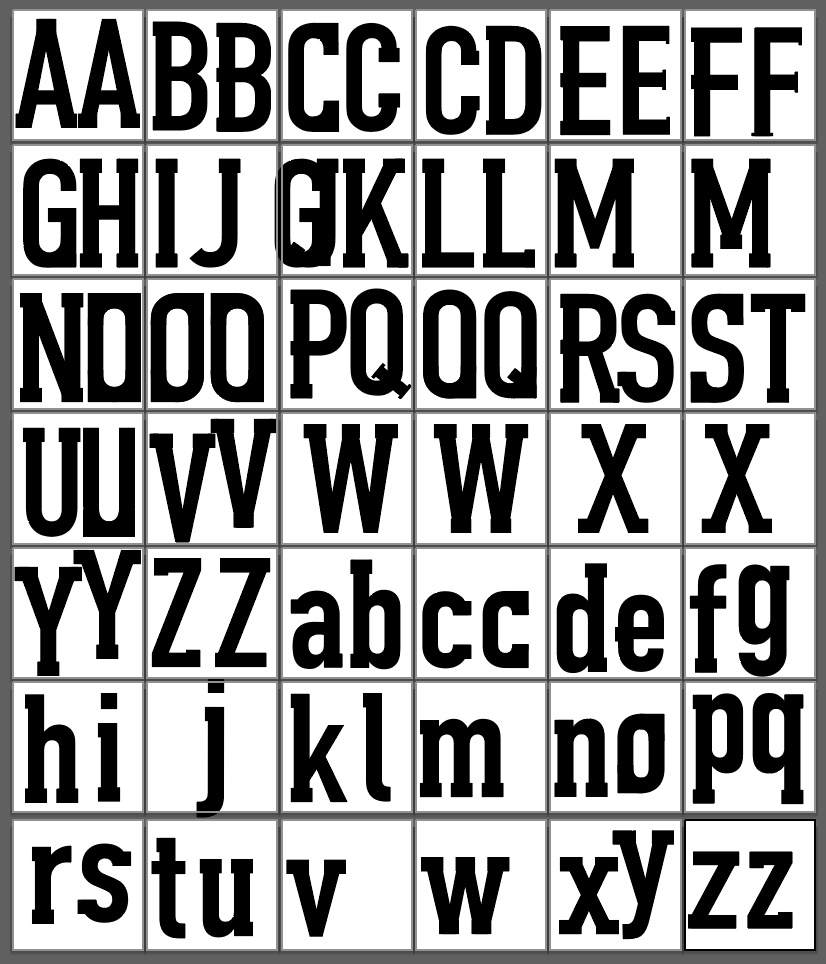

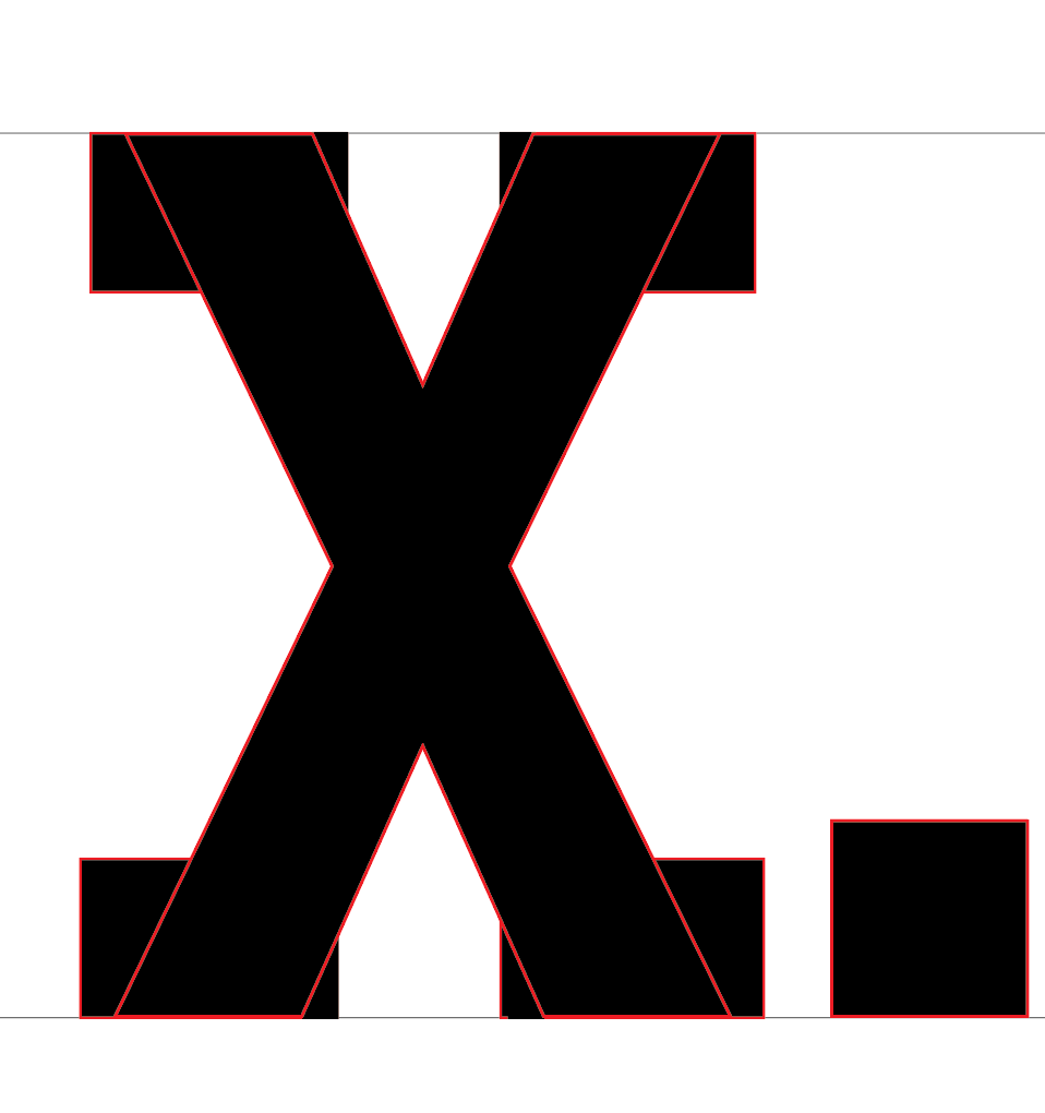


process and development of typeface

